


Fika is a fictional coffee brand inspired by the Swedish fika culture. The goal of the project was to create a warm and modern visual identity that reflects simplicity, coziness, and community. The deliverables included a logo, color palette, and typography, as well as a social media strategy supported by Instagram feed mockups and campaign visuals.
📖 Project Overview
I was responsible for the complete brand identity design, including logo, color palette, and graphic elements. I also developed the social media strategy, focusing on visual consistency and tone of voice. To illustrate the digital presence, I designed a cohesive Instagram feed along with examples of individual posts and promotional content.
🤹 My Role

Adobe Illustrator, Adobe Photoshop, Canva. Resources: Photography sourced from Pinterest for concept visualization.
🛠️ Tools


When designing the visual identity for Fika, I wanted the colors to reflect Swedish culture without relying on the obvious blue and yellow. Those shades already carry strong associations with national symbols and brands like IKEA, so instead, I chose to take inspiration from something equally Swedish but more playful and unique: Prinsesstårta. Its soft pastel green, pink, and cream tones felt like the perfect way to capture the warmth, sweetness, and joy of fika while staying true to a distinctively Swedish heritage. The name “Fika” was therefore a natural choice, connecting the brand directly to the cultural ritual it celebrates.
Concept & Inspiration

Social media is not only about following trends, it’s about building a sense of community. With Fika’s feed, I wanted to create relatable content that feels inviting and authentic, encouraging people to connect over a shared moment. The idea is to showcase more than just coffee and pastries; it’s about the experience of fika itself.
Enjoying time with friends, slowing down, and creating memories.
Instagram Strategy

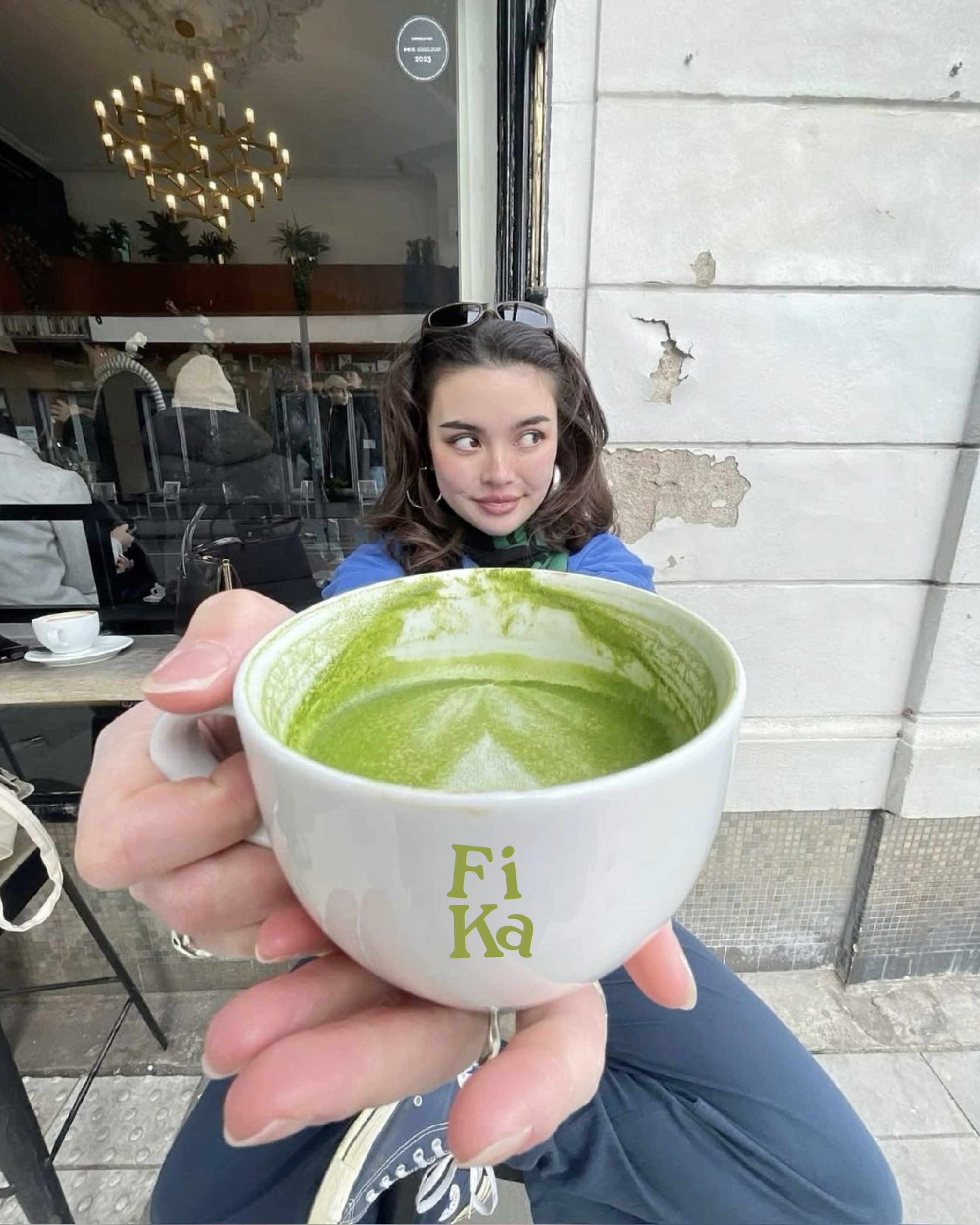
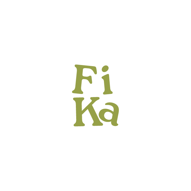
The Fika brand uses a total of three typefaces to create a cohesive and approachable visual identity. The primary typeface is Roca, which is used for the logo and key brand headings. Helvetica Neue World serves as the secondary typeface, providing clean, readable body text, while Marydale is used for handwritten-style elements, adding warmth and personality to campaign visuals. Together, these typefaces balance modernity, clarity, and a friendly, familiar feel, reinforcing the welcoming atmosphere of Fika.
Typography
Celebrate Kanelbullens Dag with Fika!
•
Celebrate Kanelbullens Dag with Fika!
•
Celebrate Kanelbullens Dag with Fika! • Celebrate Kanelbullens Dag with Fika! •

This campaign celebrates Kanelbullens Dag, a beloved Swedish tradition, by inviting people to experience a cozy Fika moment. The handwritten text was intentionally chosen to create a warm and approachable feeling, giving the visuals a personal, family-like touch. For the Fika brand, the plan is to use three consistent typefaces across all materials. In this particular image, two of them are shown: Roca (used for the logo and surrounding text near the person enjoying their pastry) and Marydale (used for the handwritten campaign text). These typefaces work together to communicate friendliness and authenticity, reinforcing the idea of enjoying fika with friends and loved ones.
The main image shows a person enjoying a pastry, capturing a joyful, relatable moment. While the photo was sourced from Pinterest and does not feature an actual cinnamon bun, it effectively conveys the emotion and atmosphere the campaign aims to inspire. By combining this image with the offer: “coffee + cinnamon roll for 45” and Fika’s logotype, the campaign presents a cohesive and inviting visual identity.
My goal for the campaign was to go beyond. Instead of only highlighting the deal, the visuals focus on creating a sense of community, relatability, and warmth. It emphasizes the experience of fika itself: slowing down, enjoying a treat, and sharing moments with others.